

1. Introduction to Mobile SEO
What is Mobile SEO?
Mobile SEO (Search Engine Optimization) is the practice of optimizing websites to enhance their visibility and performance on mobile search engines. As mobile internet usage continues to rise, businesses must prioritize mobile-friendly strategies to improve user experience and maintain competitive search rankings. A well-executed mobile SEO strategy ensures that a website loads quickly, has an intuitive and responsive design that adapts to various screen sizes, and offers seamless navigation. Additionally, it involves optimizing content to be concise and readable, improving the site’s structure for better accessibility, and ensuring that search engines can efficiently crawl and index mobile pages. Factors such as mobile-first indexing, page speed optimization, and voice search compatibility also play a significant role in mobile SEO. By focusing on these aspects, businesses can increase engagement, reduce bounce rates, and improve their chances of appearing at the top of mobile search results, ultimately driving more traffic and conversions.
The Rise of Mobile Search
Over the past decade, mobile searches have surpassed desktop searches, driven by the widespread adoption of smartphones and improved internet connectivity. Users now prefer accessing information on their mobile devices due to convenience and speed, making mobile SEO a necessity for businesses and website owners looking to maximize their online visibility. As search behavior shifts, optimizing websites for mobile has become crucial to ensuring a seamless user experience, reducing bounce rates, and increasing engagement.
Statistics highlight the growing dominance of mobile search. Over 60% of global searches now originate from mobile devices, with users exhibiting more immediate and action-driven search behavior compared to desktop users. Google also reports a significant rise in mobile searches with local intent, such as “near me” queries, reinforcing the importance of local SEO strategies. This trend underscores the need for businesses to focus on mobile-friendly website design, fast loading speeds, and local search optimization to remain competitive in the evolving digital landscape.
The Importance of Mobile-First Indexing
Google’s introduction of mobile-first indexing has made mobile-friendly websites a priority in search rankings. This means that Google primarily uses the mobile version of a website for indexing and ranking, making mobile optimization essential for maintaining visibility in search results. Websites that are not optimized for mobile risk lower rankings, reduced organic traffic, and a diminished online presence. As more users rely on smartphones for browsing, businesses must ensure their websites are fully functional and user-friendly on mobile devices to remain competitive.
To succeed in mobile-first indexing, websites must implement key optimization strategies. A responsive design is crucial to ensure that the layout adapts seamlessly to different screen sizes without compromising user experience. Additionally, the mobile version should contain the same high-quality content as the desktop version to avoid ranking penalties. Optimized images and videos, using compressed formats, help improve page load speed, which is a critical factor in mobile SEO. Furthermore, structured data and metadata should remain consistent across mobile and desktop versions to maintain ranking integrity. By addressing these factors, businesses can enhance their mobile search performance and improve their overall digital presence.
Why Mobile SEO Matters
Understanding user behavior and search engine algorithms focused on mobile is key to effective mobile SEO. Mobile users tend to have different browsing habits compared to desktop users:
- Speed Expectations: Mobile users expect web pages to load within 2-3 seconds. Slow-loading sites often experience higher bounce rates.
- Navigation Simplicity: Users prefer easy-to-navigate websites with large touch-friendly buttons and minimal distractions.
- Local Search Focus: Many mobile searches are location-based, making local SEO crucial for businesses targeting specific geographical areas.
- Voice Search Optimization: With the rise of digital assistants like Siri, Google Assistant, and Alexa, optimizing for conversational queries and long-tail keywords is essential.
2. Mobile SEO Best Practices
Mobile-Friendly Design: Key Elements for Usability and Design
A mobile-friendly website is designed to provide an optimal user experience on smaller screens by ensuring easy navigation, fast loading times, and responsive design that adapts to various devices. With most users accessing the internet via smartphones, a well-optimized mobile site enhances usability, reduces bounce rates, and increases engagement. Additionally, Google prioritizes mobile-friendly websites in search rankings, making mobile optimization crucial for SEO success. Key elements include:
- Touch-Friendly Navigation:
- Buttons and links should be large enough to tap easily (minimum 44×44 pixels).
- Ensure adequate spacing between interactive elements to prevent accidental clicks.
- Readable Content:
- Use a legible font size (16px or larger for body text).
- Choose fonts that are easy to read on small screens.
- Break content into short paragraphs and use subheadings for better scannability.
- Simplified Layout:
- Prioritize essential content and features.
- Use collapsible menus (e.g., hamburger menus) to save space.
- Avoid clutter and keep the design clean and intuitive.
- Avoid Intrusive Elements:
- Minimize pop-ups and interstitials that disrupt the user experience.
- If pop-ups are necessary, ensure they are easy to close on mobile devices.
Responsive Design: Adapting to Different Screen Sizes and Devices
Responsive design ensures your website looks and functions well on all devices, from smartphones to tablets and desktops, by automatically adjusting its layout, images, and content to fit different screen sizes. This adaptability enhances user experience by providing seamless navigation, readable text, and touch-friendly elements without requiring excessive zooming or scrolling. A responsive website also improves SEO performance, as search engines like Google prioritize mobile-friendly sites in their rankings. Key considerations include:
- Fluid Grids and Layouts:
- Use flexible grid systems that adjust to the screen size.
- Ensure content reflows naturally without horizontal scrolling.
- Media Queries:
- Apply CSS media queries to adjust styles based on screen width, height, and orientation.
- Testing Across Devices:
- Test your website on various devices and screen sizes to ensure consistency.
- Use tools like Google’s Mobile-Friendly Test or browser developer tools to simulate different devices.
- Avoid Separate Mobile URLs:
- Use a single URL for both desktop and mobile versions to avoid confusion and maintenance challenges.
- Implement responsive design instead of creating separate mobile sites (e.g., m.domain.com).
Page Speed Optimization: Improving Load Times for Mobile Users
Page speed is critical for mobile SEO, as slow-loading pages lead to higher bounce rates, lower user engagement, and decreased search rankings. Mobile users expect fast, seamless experiences, and studies show that most visitors abandon a site if it takes more than a few seconds to load. Google also considers page speed as a ranking factor, making optimization essential for better visibility. Techniques such as image compression, browser caching, and minimizing unnecessary scripts help improve loading times. By prioritizing speed optimization, businesses can enhance user satisfaction, reduce bounce rates, and improve their mobile search performance.
Key strategies include:
- Compress Files:
- Minify CSS, JavaScript, and HTML to reduce file sizes.
- Use tools like Gzip or Brotli for compression.
- Enable Browser Caching:
- Store static resources (e.g., images, CSS, JavaScript) in the user’s browser cache to reduce load times for returning visitors.
- Set appropriate cache expiration headers.
- Reduce Redirects:
- Minimize the number of redirects, as each redirect adds additional HTTP requests and increases load time.
- Fix broken links and ensure internal links point directly to the correct URLs.
- Optimize Images:
- Compress images without sacrificing quality using tools like TinyPNG or Squoosh.
- Use modern image formats like WebP for better compression.
- Specify image dimensions to prevent layout shifts.
- Leverage a Content Delivery Network (CDN):
- Use a CDN to serve content from servers closer to the user, reducing latency and improving load times.
- Prioritize Above-the-Fold Content:
- Load critical content first to improve perceived performance.
- Defer non-essential JavaScript and CSS.
Optimizing for Core Web Vitals
Google’s Core Web Vitals are a set of user-centric metrics that evaluate a website’s real-world performance, focusing on loading speed, interactivity, and visual stability. These metrics play a crucial role in search rankings, as Google prioritizes sites that provide a smooth and efficient user experience. The three key components include Largest Contentful Paint (LCP), which measures loading performance; First Input Delay (FID), which assesses interactivity; and Cumulative Layout Shift (CLS), which evaluates visual stability. Optimizing these factors ensures faster load times, responsive interactions, and a visually consistent experience, ultimately improving user satisfaction and boosting search engine visibility. Here’s a detailed breakdown of each metric and how to optimize for them:
1. Largest Contentful Paint (LCP): Loading Performance:
What is LCP? LCP measures how quickly the largest content element (e.g., a hero image, video, or block of text) becomes visible within the viewport. It’s a key indicator of perceived load speed.
Goal: LCP should occur within 2.5 seconds or less.
How to Optimize LCP:
Optimize Server Response Time:
- Use a reliable hosting provider with fast servers.
- Implement server-side caching to reduce response times.
- Use a Content Delivery Network (CDN) to serve content from servers closer to the user.
Optimize Critical Rendering Path:
- Minimize render-blocking resources (e.g., CSS and JavaScript).
- Use async or defer attributes for non-critical JavaScript.
- Inline critical CSS to speed up rendering.
Optimize Largest Content Elements:
- Compress and serve images in modern formats like WebP.
- Use responsive images with the srcset attribute to serve appropriately sized images.
- Preload important resources (e.g., hero images) using the <link rel=”preload”> tag.
Reduce JavaScript Execution Time:
- Minify and compress JavaScript files.
- Remove unused JavaScript code.
- Use code-splitting to load only the necessary JavaScript for each page.
2. First Input Delay (FID): Interactivity
What is FID?
FID measures the time from when a user first interacts with your page (e.g., clicking a button or link) to when the browser responds to that interaction. It reflects how responsive your website feels to users.
Goal: FID should be 100 milliseconds or less.
How to Optimize FID:
- Reduce JavaScript Execution Time:
- Break up long JavaScript tasks into smaller, asynchronous tasks.
- Use web workers to offload heavy computations to a background thread.
- Defer non-critical JavaScript until after the page has loaded.
- Minimize Main Thread Work:
- Avoid large, complex layouts and excessive DOM manipulation.
- Optimize CSS selectors to reduce rendering time.
- Use requestIdleCallback to schedule non-urgent tasks.
- Optimize Third-Party Scripts:
- Limit the number of third-party scripts (e.g., ads, analytics, social widgets).
- Load third-party scripts asynchronously or defer their loading.
- Use the rel=”preconnect” or rel=”dns-prefetch” attributes for third-party domains.
- Improve Server Response Time:
- Ensure your server responds quickly to user requests.
- Use caching and a CDN to reduce server response times.
3. Cumulative Layout Shift (CLS): Visual Stability
What is CLS?
CLS measures how much visible content shifts unexpectedly during page load. A high CLS score indicates a poor user experience, as users may accidentally click on the wrong element due to layout shifts.
Goal: CLS should be 0.1 or less.
How to Optimize CLS:
- Specify Dimensions for Media:
- Always include width and height attributes for images and videos.
- Use aspect ratio boxes or CSS aspect-ratio property to reserve space for media.
- Avoid Dynamically Injected Content:
- Reserve space for ads, embeds, or other dynamically loaded content.
- Avoid inserting new content above existing content unless triggered by user interaction.
- Optimize Fonts:
- Use font-display: swap to ensure text remains visible during font loading.
- Preload critical fonts to reduce layout shifts caused by font swapping.
- Stabilize Animations and Transitions:
- Avoid animating properties that trigger layout changes (e.g., width, height, top, left).
- Use transform and opacity for animations, as they don’t cause layout shifts.
- Test and Monitor CLS:
- Use tools like Google’s Lighthouse or PageSpeed Insights to identify and fix layout shifts.
- Monitor CLS in real-world scenarios using Google Search Console.
Tools for Measuring and Optimizing Core Web Vitals
- Google PageSpeed Insights: Analyzes your website’s performance and provides actionable recommendations.
- Lighthouse: A Chrome DevTools feature for auditing performance, accessibility, and SEO.
- Web Vitals Extension: A Chrome extension that provides real-time feedback on Core Web Vitals.
- Google Search Console: Tracks Core Web Vitals data for your website and highlights areas for improvement.
Why Core Web Vitals Matter
- User Experience: Faster, more stable, and interactive websites lead to higher user satisfaction and engagement.
- SEO Rankings: Core Web Vitals are direct ranking factors, so optimizing them can improve your search engine visibility.
- Conversion Rates: A better user experience often translates to higher conversion rates and lower bounce rates.
3. Mobile-Specific Content
Creating content specifically tailored for mobile users is essential for delivering a seamless and engaging experience. Since mobile screens are smaller and users tend to browse in shorter, more focused sessions, content should be concise, scannable, and visually appealing. Using short paragraphs, bullet points, and clear headings improves readability, while optimizing font sizes and spacing enhances user experience. Additionally, incorporating fast-loading images, mobile-friendly videos, and touch-friendly elements ensures smooth navigation. By structuring content for mobile consumption, businesses can capture user attention quickly, reduce bounce rates, and improve their search rankings. Here’s how to optimize your content for mobile devices:
Concise Paragraphs
Mobile users prefer content that is easy to read and digest quickly. Long blocks of text can be overwhelming on small screens.
Best Practices:
- Use Short Sentences: Break down complex ideas into simple, bite-sized sentences.
- Write Scannable Content:
- Use bullet points or numbered lists to highlight key information.
- Keep paragraphs short (2-3 sentences max).
- Avoid jargon and use simple language.
- Prioritize Key Information:
- Place the most important content at the top of the page (above the fold).
- Use the inverted pyramid style: start with the conclusion, followed by supporting details.
Clear Headings
Headings help users quickly navigate and understand the structure of your content. They are especially important on mobile devices, where scrolling is more common.
Best Practices:
- Use Hierarchical Headings:
- Structure your content with <h1> for the main title, <h2> for section headings, and <h3> for subheadings.
- Ensure headings are descriptive and accurately reflect the content below them.
- Break Content into Sections:
- Divide long articles or pages into smaller sections with clear headings.
- Use whitespace generously to separate sections and improve readability.
- Make Headings Actionable:
- Use action-oriented language in headings to engage users (e.g., “5 Tips to Improve Mobile SEO” instead of “Mobile SEO Tips”).
Simplified Navigation
Complex navigation menus can frustrate mobile users and make it difficult for them to find what they’re looking for. Simplifying navigation is key to a positive mobile experience.
Best Practices:
- Use a Hamburger Menu:
- A collapsible hamburger menu (☰) saves space and keeps the interface clean.
- Ensure the menu is easy to open and close with a single tap.
- Limit Menu Items:
- Focus on the most important pages or categories.
- Use dropdowns sparingly, as they can be difficult to use on mobile.
- Add a Search Bar:
- Include a prominent search bar to help users quickly find specific content.
- Use Breadcrumbs:
- Breadcrumbs (e.g., Home > Blog > Mobile SEO) help users understand their location on your site and navigate back easily.
- Sticky Navigation:
- Implement a sticky header or footer menu that remains visible as users scroll.
- Ensure the sticky menu is compact and doesn’t take up too much screen space.
Additional Tips for Mobile-Specific Content
- Optimize for Thumb Use:
- Place key interactive elements (e.g., buttons, links) within easy reach of the user’s thumb.
- Ensure buttons are large enough (minimum 44×44 pixels) to tap comfortably.
- Avoid Intrusive Pop-ups:
- Pop-ups that cover the entire screen can be frustrating on mobile devices.
- If pop-ups are necessary, make them easy to close and ensure they don’t block critical content.
- Use Visuals Wisely:
- Include images, videos, and infographics to break up text and make content more engaging.
- Optimize visuals for mobile by compressing files and using responsive design.
- Test on Multiple Devices:
- Test your content on various devices and screen sizes to ensure it looks and functions as intended.
- Use tools like Google’s Mobile-Friendly Test or BrowserStack for cross-device testing.
Why Mobile-Specific Content Matters
- Improved User Experience: Content tailored for mobile devices is easier to read, navigate, and interact with.
- Higher Engagement: Scannable and visually appealing content keeps users on your site longer.
- Better SEO Performance: Mobile-friendly content improves your chances of ranking higher in mobile search results.
- Increased Conversions: A seamless mobile experience can lead to higher conversion rates and lower bounce rates.
4. Image Optimization
Images are a critical part of web content, but if not optimized properly, they can significantly slow down page load times, negatively affecting user experience and SEO rankings. For mobile users, fast-loading images are essential to ensure smooth navigation and engagement. Using compressed image formats like WebP, lazy loading techniques, and responsive image sizing helps reduce file sizes without compromising quality. Additionally, implementing proper alt text and structured data enhances accessibility and search engine visibility. By optimizing images effectively, businesses can improve page speed, retain visitors, and boost their mobile search performance. Here’s how to optimize images for mobile SEO:
Use Next-Gen Image Formats
Modern image formats like WebP, AVIF, and JPEG XL offer superior compression and quality compared to traditional formats like JPEG and PNG.
- Why Use Next-Gen Formats?:
- Smaller file sizes without compromising quality.
- Faster load times, especially on mobile devices with slower connections.
- How to Implement:
- Convert images to WebP using tools like Squoosh, ImageMagick, or plugins like ShortPixel.
- Use the <picture> element to serve next-gen formats to supported browsers while providing fallbacks for older browsers:

Implement Lazy Loading
Lazy loading ensures that images are only loaded when they come into the user’s viewport, reducing initial page load time and saving bandwidth.
- Why Use Lazy Loading?:
- Improves page speed by deferring offscreen image loading.
- Enhances user experience, especially on content-heavy pages.
- How to Implement:

- For older browsers, use JavaScript-based lazy loading libraries like Lazysizes or Lozad.js.
- Avoid lazy loading images above the fold, as these should load immediately.
Compress and Resize Images
Even with next-gen formats, compressing and resizing images is crucial for mobile optimization.
- Best Practices:
- Use tools like TinyPNG, Compressor.io, or ImageOptim to compress images.
- Resize images to fit the maximum display size on mobile devices (e.g., 800px width for most screens).
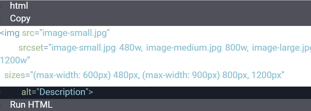
- Use responsive images with the srcset attribute to serve appropriately sized images based on the device:
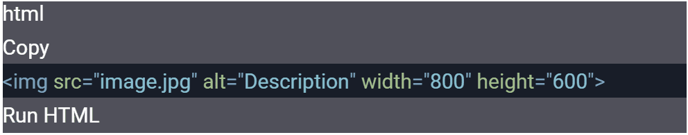
Specify Image Dimensions
Specifying image dimensions prevents layout shifts, which can negatively impact Cumulative Layout Shift (CLS).
- How to Implement:
- Always include width and height attributes for images:
- Use CSS to maintain aspect ratios:

5. Mobile-Friendly URLs
URLs play a significant role in both user experience and SEO, especially for mobile users who navigate on smaller screens. Mobile-friendly URLs should be short, descriptive, and easy to read, making them simple to share and understand. Avoiding long strings of numbers or unnecessary parameters enhances clarity and improves search engine indexing. Additionally, using hyphens to separate words and maintaining a logical site structure contribute to better usability and ranking performance. By optimizing URLs for mobile devices, businesses can enhance accessibility, improve click-through rates, and create a more seamless browsing experience.
Keep URLs Short and Descriptive
- Why It Matters:
- Short URLs are easier to read, type, and share on mobile devices.
- Descriptive URLs provide context about the page content, improving user trust and SEO.
- Best Practices:
- Use clear, concise words that reflect the page’s content.
- Avoid long strings of numbers or random characters.
- Example:
- Good: example.com/mobile-seo-tips
- Bad: example.com/index.php?id=12345&cat=seo
Avoid Unnecessary Parameters
- Why It Matters:
- Parameters (e.g., ?utm_source=google) can make URLs look messy and confusing.
- Excessive parameters can also lead to duplicate content issues.
- Best Practices:
- Use clean URLs without unnecessary query strings.
- If parameters are required (e.g., for tracking), keep them minimal and use URL shortening tools if needed.
Avoid Deep URL Structures
- Why It Matters:
- Deep URL structures (e.g., example.com/category/subcategory/page) can be confusing and harder to navigate on mobile devices.
- Shallow URLs are easier to remember and share.
- Best Practices:
- Limit the number of subfolders in your URLs.
- Use a flat structure where possible:
- Good: example.com/mobile-seo-tips
- Bad: example.com/blog/seo/mobile/tips
Use Hyphens to Separate Words
- Why It Matters:
- Hyphens make URLs easier to read and understand, especially on mobile devices.
- Search engines recognize hyphens as word separators, improving SEO.
- Best Practices:
- Use hyphens (-) instead of underscores (_) or spaces (%20).
- Example:
- Good: example.com/mobile-seo-tips
- Bad: example.com/mobile_seo_tips
Make URLs Case-Sensitive and Consistent
- Why It Matters:
- Inconsistent URLs (e.g., example.com/Mobile-SEO-Tips vs. example.com/mobile-seo-tips) can lead to duplicate content issues.
- Case-sensitive URLs can confuse users and search engines.
- Best Practices:
- Use lowercase letters for all URLs.
- Implement 301 redirects to ensure consistency if multiple URL variations exist.
Why Image Optimization and Mobile-Friendly URLs Matter
- Improved Page Speed: Optimized images and clean URLs contribute to faster load times, which are critical for mobile users.
- Better User Experience: Easy-to-read URLs and fast-loading images enhance usability and engagement.
- Higher SEO Rankings: Mobile-friendly practices like image optimization and clean URLs are ranking factors that improve search visibility.
- Increased Conversions: A seamless mobile experience leads to higher user satisfaction and better conversion rates.
6. Accelerated Mobile Pages (AMP)
Accelerated Mobile Pages (AMP) is an open-source framework designed to create ultra-fast, lightweight web pages optimized for mobile devices. By stripping pages down to their essential elements and using streamlined HTML, CSS, and JavaScript, AMP ensures near-instant loading speeds. Faster page load times improve user experience, reduce bounce rates, and enhance search rankings, as Google often prioritizes AMP pages in mobile search results. Additionally, AMP supports caching, which allows content to be served more efficiently. By implementing AMP, businesses can provide a smoother browsing experience, boost engagement, and improve overall mobile SEO performance.
Why AMP Matters
- Speed: AMP pages load 85% faster than traditional mobile pages, providing a near-instantaneous experience for users.
- Improved User Experience: Faster load times reduce bounce rates and increase engagement.
- SEO Benefits: While AMP is not a direct ranking factor, faster-loading pages can indirectly improve rankings by enhancing user experience and reducing bounce rates.
- Visibility in Search Results: AMP pages may appear in special carousels or features in mobile search results, increasing visibility.
How to Implement AMP
- Set Up AMP HTML:
- Use the AMP HTML framework, which restricts certain elements (e.g., custom JavaScript) to ensure fast loading.
- Use AMP Components:
- Replace standard HTML elements with AMP-specific components (e.g., <amp-img> for images, <amp-video> for videos).
- Add interactive features using AMP components like <amp-carousel> or <amp-form>.
- Validate AMP Pages:
- Use the AMP Validator to ensure your pages meet AMP standards.
- Fix any errors or warnings before publishing.
- Link AMP and Canonical Pages:
- Add a canonical link to the original page in the AMP version:
- Add a reference to the AMP version in the original page:
- Test and Monitor:
- Use tools like Google Search Console to monitor AMP performance and fix issues.
- Test AMP pages on multiple devices to ensure compatibility.
Challenges of AMP
- Limited Functionality: AMP restricts the use of custom JavaScript and certain design elements.
- Maintenance Overhead: Maintaining both AMP and non-AMP versions of a page can be resource-intensive.
- Declining Adoption: Some publishers have moved away from AMP due to its limitations and Google’s shifting focus on Core Web Vitals.
Continue Reading:
Mobile SEO: Best Practices to Rank Higher on Mobile Searches / Part 1
Mobile SEO: Best Practices to Rank Higher on Mobile Searches / Part 2
Mobile SEO: Best Practices to Rank Higher on Mobile Searches / Part 3
Written by Temesgen Ufaysa Dola