Introduction to Landing Pages
What is a Landing Page?
A landing page is a standalone web page distinct from a website’s main homepage, specifically created for a marketing or advertising campaign. Its primary purpose is to convert visitors into leads or customers by directing them toward a specific action. Here’s a detailed exploration of its components, functions, and best practices:
Join the Course Today: https://erp.raznameh.org/register-on-marketing-course
Explore the Course Topics: https://erp.raznameh.org/slides/the-sales-and-marketing-playbook-15
1. Purpose and Goals
- Conversion Focused: The primary objective of a landing page is to achieve a specific conversion goal, such as capturing leads, generating sales, or encouraging sign-ups. This is often reflected in the design and content, which are tailored to prompt a particular action.
- Targeted Messaging: Unlike general web pages, landing pages are crafted with focused messaging that resonates with the specific audience segment targeted by the marketing campaign.
2. Key Components
- Headline: A compelling and clear headline that grabs attention and conveys the main benefit or offer.
- Subheadline: A supportive statement that elaborates on the headline and further entices visitors to read on.
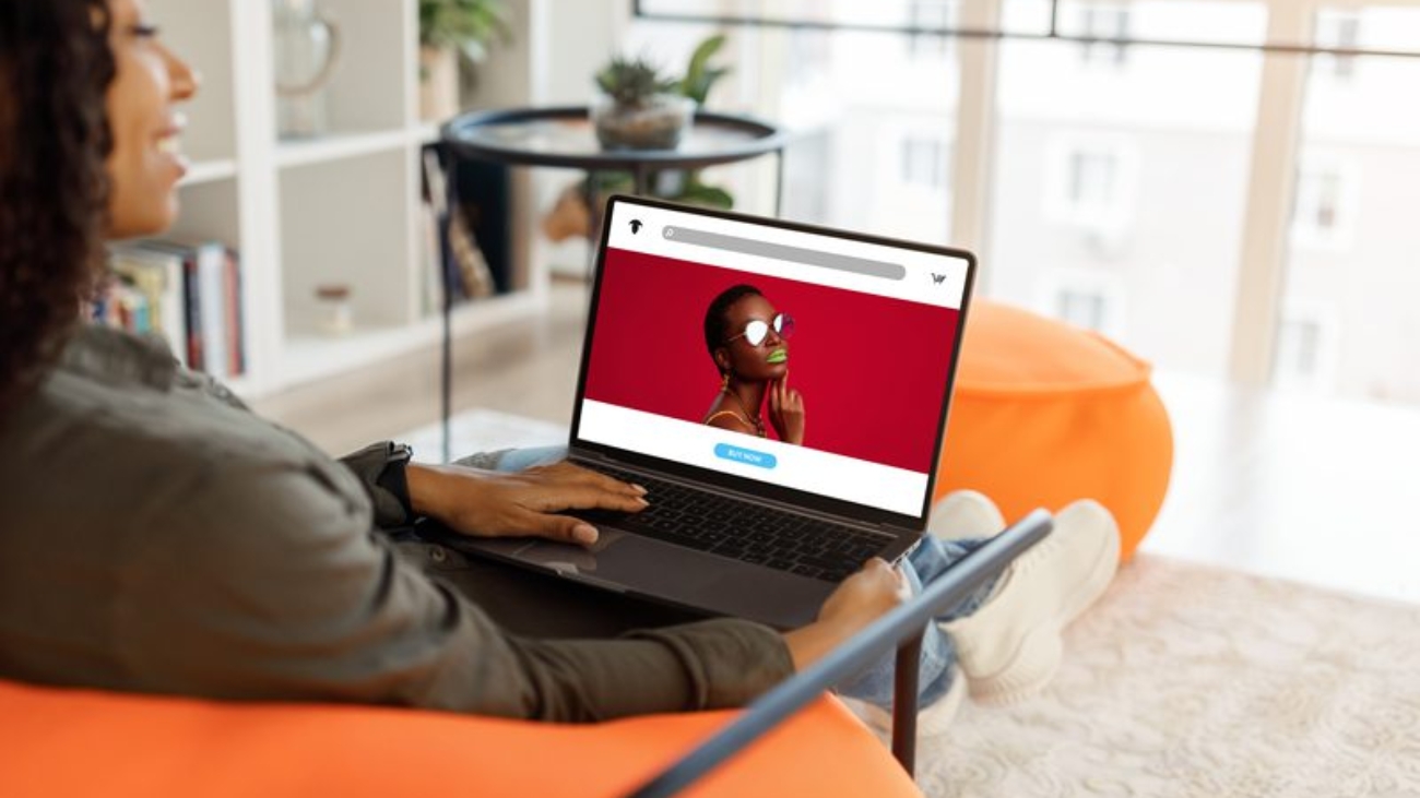
- Visual Elements: Images, videos, or graphics that enhance the message and make the page visually appealing, often demonstrating the product or service in action.
- Body Copy: Concise and persuasive text that explains the offer, its benefits, and why the visitor should take action. This may include bullet points for clarity and emphasis.
- Call-to-Action (CTA): A prominent and clear CTA button that instructs visitors on the desired action, such as “Download Now,” “Get Your Free Trial,” or “Subscribe Today.” The CTA should stand out visually and be strategically placed on the page.
- Form: If the goal is lead generation, a form may be included to collect user information, such as name, email, or phone number. The form should be easy to complete, with as few fields as necessary to reduce friction.
- Social Proof: Testimonials, reviews, case studies, or trust badges that enhance credibility and reassure visitors about the quality of the offer.
Types of Landing Pages
There are several types of landing pages, each designed to serve a specific purpose within digital marketing campaigns. These pages are tailored based on the action you want users to take, whether it’s generating leads, making sales, or engaging users. Below are the most common types of landing pages:
Lead Generation Landing Page
A lead generation landing page is a specific type of web page designed to capture visitor information, such as names and email addresses, in exchange for something of value. This could be a free resource, a discount, a trial subscription, or any other incentive that encourages visitors to provide their contact information.
1. Key Components of a Lead Generation Landing Page
- Compelling Headline
- A clear and engaging headline that immediately communicates the value of the offer. It should grab attention and encourage visitors to continue reading.
- Subheadline
- A brief description or supporting statement that elaborates on the headline, providing more context about the offer.
- Value Proposition
- A concise explanation of what the visitor will gain by providing their information. This could include benefits of the offer, such as solving a problem or enhancing their experience.
- Visual Elements
- Relevant images, graphics, or videos that illustrate the offer. Visuals should enhance understanding and appeal to emotions.
- Lead Capture Form
- A form where visitors can enter their information (e.g., name, email address, phone number). The form should be simple and only ask for essential information to minimize friction.
- Call-to-Action (CTA) Button: A prominent button that encourages visitors to submit their information. The CTA should use action-oriented language (e.g., “Download Now,” “Get Your Free Trial,” “Sign Up Today”).
- Social Proof
- Testimonials, reviews, or endorsements that build trust and credibility. Social proof helps reassure visitors that others have benefited from the offer.
- Privacy Assurance
- A brief statement ensuring visitors that their information will be kept confidential and not shared with third parties. This helps to alleviate privacy concerns.
- Additional Information
- If applicable, provide more details about the offer, such as features, FAQs, or a brief overview of what to expect after signing up.
2. Best Practices for Creating a Lead Generation Landing Page
- Keep It Focused
- Limit distractions by removing unnecessary links or navigation elements. The goal is to keep the visitor focused on the lead capture form.
- Optimize for Mobile
- Ensure the landing page is mobile-friendly, as many users will access it on smartphones or tablets.
- A/B Testing
- Test different versions of the landing page (headlines, images, CTAs) to determine which elements lead to higher conversion rates.
- Use Action-Oriented Language
- Craft your copy to be engaging and actionable. Use verbs that encourage visitors to take immediate action.
- Track Performance
- Use analytics tools to monitor the performance of the landing page, including traffic sources, conversion rates, and user behavior. This data is crucial for continuous improvement.
3. Example Scenarios
- Ebooks or White Papers: Offer a free download of a valuable guide in exchange for the visitor’s email address.
- Webinars: Invite users to register for a free webinar by filling out a lead capture form.
- Free Trials: Provide access to a trial version of a product or service in exchange for contact information.
- Discounts: Offer a percentage off future purchases when visitors sign up for the newsletter.
Click-Through Landing Page
A click-through landing page is a type of web page designed to guide visitors toward taking a specific action, typically leading them to another page, such as a product detail page or a checkout page. Unlike lead generation landing pages, which focus on capturing visitor information, click-through landing pages are more about persuasion and providing relevant information that encourages users to click on a call-to-action (CTA).
1. Key Components of a Click-Through Landing Page
- Compelling Headline
- A strong, attention-grabbing headline that clearly communicates the main benefit or offer of the product or service.
- Subheadline
- A supportive statement that provides additional context and reinforces the value proposition.
- Engaging Visuals
- High-quality images, videos, or graphics that showcase the product or service. Visual elements should enhance the message and create emotional engagement.
- Product/Service Description
- A concise and persuasive description that highlights the features, benefits, and unique selling points. This section should address potential customer pain points and how the product or service solves them.
- Call-to-Action (CTA)
- A prominent CTA button that encourages visitors to take the next step (e.g., “Shop Now,” “Learn More,” “Get Started”). The CTA should be visually distinct and use actionable language.
- Social Proof
- Testimonials, user reviews, or ratings that help build credibility and trust. This could also include case studies or endorsements from influencers.
- Benefits List
- A bulleted list of key benefits or features that quickly communicates the value of the offering, making it easy for visitors to understand what they’ll gain.
- Minimal Distractions
- Keep the design focused by minimizing navigation options and other elements that could divert attention away from the CTA.
2. Best Practices for Creating a Click-Through Landing Page
- Maintain Focus
- Ensure the page has a singular focus on the CTA, avoiding links or content that may lead visitors away from the desired action.
- Mobile Optimization
- Design the page to be mobile-friendly, ensuring it looks good and functions well on all devices.
- Use Strong Visuals
- Incorporate eye-catching visuals that complement the text and enhance the overall message, such as lifestyle images or product demos.
- Test and Optimize
- Conduct A/B testing on different elements (headlines, CTAs, visuals) to determine which combinations yield the best conversion rates.
- Clear Navigation
- While the primary goal is to guide users to the CTA, ensure that any necessary navigation is intuitive and does not distract from the main purpose.
3. Example Scenarios
- E-Commerce: A click-through landing page might promote a new product line, encouraging visitors to click through to view the full catalogue or product details.
- Event Promotion: A landing page for a conference might highlight key speakers and sessions, leading visitors to a registration page.
- Service Offerings: A software company may create a page that outlines the benefits of its service, prompting users to click through for a free trial or demo
Squeeze Page
A squeeze page is a type of landing page specifically designed to capture a visitor’s contact information, typically an email address, by offering something of value in return. The goal of a squeeze page is to “squeeze” information from the visitor without providing too many distractions or links that could lead them away from the action you want them to take.
1. Key Components of a Squeeze Page
- Compelling Headline
- A strong, attention-grabbing headline that clearly states the offer or benefit the visitor will receive by providing their information.
- Subheadline
- A supporting statement that adds more detail to the headline and entices visitors to continue reading.
- Value Proposition
- A clear explanation of what the visitor will gain, such as a free ebook, newsletter subscription, webinar access, or a discount. This should emphasize the benefits of signing up.
- Lead Capture Form
- A simple form where visitors enter their information (usually just an email address, but sometimes a name). The fewer fields required, the higher the likelihood of conversion.
- Call-to-Action (CTA)
- A prominent CTA button that encourages users to take action, such as “Get Your Free Guide” or “Subscribe Now.” The button should stand out visually and use persuasive language.
- Visual Elements
- Relevant images or graphics that support the offer, such as a cover image of the ebook or a snapshot from a webinar. Visuals should be appealing and enhance the message.
- Social Proof (Optional)
- Testimonials or endorsements that build trust and credibility. If applicable, showcase how others have benefited from the offer.
- Privacy Assurance
- A brief note ensuring visitors that their information will be kept confidential and not shared with third parties, alleviating privacy concerns.
2. Best Practices for Creating a Squeeze Page
- Focus on Simplicity
- Keep the design minimal to eliminate distractions. Remove navigation links and other elements that could divert attention from the CTA.
- Highlight the Benefits
- Clearly communicate what visitors will gain from signing up. Focus on the value proposition and benefits of the offer.
- Mobile Optimization
- Ensure the squeeze page is responsive and looks good on mobile devices, as many visitors may be accessing it via smartphones or tablets.
- Use A/B Testing
- Test different headlines, CTAs, and form placements to determine which variations lead to higher conversion rates.
- Clear and Persuasive Language
- Use straightforward, compelling language that resonates with your target audience. Avoid jargon and focus on clarity.
3. Example Scenarios
- Ebooks or Guides: Offering a free ebook in exchange for an email address is a common use of a squeeze page. For instance, a marketing blog might offer a guide on “10 Tips for Effective Content Marketing.”
- Newsletters: A company might use a squeeze page to encourage visitors to subscribe to a newsletter that promises exclusive tips, insights, or discounts.
- Webinars: A squeeze page could promote a free webinar, capturing registrants’ information in exchange for a spot in the session.
Sales Page
A sales page is a dedicated web page designed specifically to sell a product or service. Its primary goal is to persuade visitors to make a purchase by presenting compelling information and encouraging immediate action. Sales pages are often part of a larger marketing strategy and can be used in various contexts, including e-commerce, service offerings, and digital products.
1. Key Components of a Sales Page
- Compelling Headline
- An attention-grabbing headline that clearly states the main benefit of the product or service. It should entice visitors to read further.
- Engaging Subheadline
- A supportive subheadline that expands on the headline, providing additional context and reinforcing the value proposition.
- Product Description
- A detailed description of the product or service, highlighting its features, benefits, and unique selling points. This section should address potential customer pain points and how the offering solves them.
- High-Quality Visuals
- Images, videos, or graphics that showcase the product in use. Visuals should enhance understanding and create an emotional connection with the audience.
- Social Proof
- Testimonials, reviews, case studies, or endorsements that build credibility and trust. This could include user-generated content or statistics that demonstrate the product’s effectiveness.
- Clear Call-to-Action (CTA)
- A prominent and persuasive CTA button that encourages visitors to take the next step (e.g., “Buy Now,” “Get Yours Today,” “Add to Cart”). The CTA should stand out and use actionable language.
- Pricing Information
- Clear and transparent pricing, including any discounts or special offers. If applicable, highlight the value of the purchase, such as potential savings or bonuses.
- Risk Reversal
- Guarantees or return policies that reduce the perceived risk of purchasing. For example, offering a money-back guarantee can help reassure hesitant buyers.
- FAQs
- A section addressing common questions or concerns about the product or service. This helps alleviate objections and provides additional information to potential buyers.
- Urgency and Scarcity
- Techniques to create a sense of urgency (e.g., limited-time offers) or scarcity (e.g., limited stock) can motivate visitors to make a decision quickly.
2. Best Practices for Creating a Sales Page
- Focus on Benefits, Not Just Features
- Highlight how the product or service improves the customer’s life or solves their problems. Clearly communicate the benefits rather than just listing features.
- Use Persuasive Language
- Write a copy that resonates with the target audience. Use emotive language and storytelling techniques to engage readers and create a connection.
- Optimise for Mobile
- Ensure the sales page is responsive and functions well on mobile devices, as many customers shop via smartphones or tablets.
- A/B Testing
- Experiment with different headlines, layouts, images, and CTAs to determine which elements yield the highest conversion rates.
- Simple Navigation
- Keep the page layout clean and straightforward, minimizing distractions while guiding visitors toward the CTA.
3. Example Scenarios
- E-Commerce Products: A sales page for a new gadget might include detailed descriptions, customer reviews, and a prominent “Buy Now” button to drive conversions.
- Online Courses: An online learning platform may use a sales page to promote a course, detailing the curriculum, benefits, testimonials, and pricing options.
- Membership Sites: A sales page could promote a subscription service, outlining membership benefits, testimonials, and a clear CTA to sign up.
A sales page is a crucial element of any online marketing strategy, designed to convert visitors into customers by effectively communicating the value of a product or service. By focusing on compelling content, strong visuals, and persuasive calls to action, businesses can optimize their sales pages to drive conversions and maximize revenue.
Thank You Page
A thank you page is a web page displayed after a visitor has completed a desired action, such as making a purchase, signing up for a newsletter, or submitting a contact form. Its primary purpose is to acknowledge the action taken by the visitor and confirm that their request has been received. Thank you pages can also serve as an opportunity for further engagement and marketing.
1. Key Components of a Thank You Page
- Gratitude Message
- A warm and sincere thank you message that expresses appreciation for the visitor’s action. This helps to create a positive impression and reinforces the customer relationship.
- Confirmation of Action
- Clear information confirming what the visitor has done, such as “Your order has been successfully placed” or “You are now subscribed to our newsletter.” This reassures visitors that their action was successful.
- Next Steps
- Information on what the visitor can expect next, such as delivery timelines for purchases, access details for digital products, or when to expect further communication.
- Call-to-Action (CTA)
- An opportunity to guide visitors to take another action, such as:
- Exploring related products or services.
- Sharing their purchase on social media.
- Inviting them to follow the brand on social media platforms.
- An opportunity to guide visitors to take another action, such as:
- Incentives
- Offering additional resources or incentives, such as discounts on future purchases, free downloads, or exclusive content, can enhance user engagement.
- Social Proof
- Displaying testimonials, reviews, or case studies can further build trust and encourage new customers to feel confident about their decision.
- Visual Elements
- Using engaging visuals, such as images or videos, can enhance the message and make the page visually appealing.
2. Best Practices for Creating an Effective Thank You Page
- Keep It Simple
- The design should be straightforward, focusing on the thank you message and next steps without unnecessary distractions.
- Personalization
- If possible, personalize the message by addressing the visitor by name or referencing their specific action (e.g., “Thank you for purchasing [Product Name]!”).
- Mobile Optimization
- Ensure that the thank you page is mobile-friendly, as many users will view it on their smartphones or tablets.
- Track Performance
- Use analytics to monitor how many users reach the thank you page and how they interact with it, which can provide insights for future optimization.
- A/B Testing
- Experiment with different messages, designs, or CTAs to determine what resonates best with your audience.
3. Example Scenarios
- E-Commerce: After a customer completes a purchase, the thank you page confirms the order and provides an estimated delivery date, along with links to related products.
- Newsletter Sign-Up: A thank you page for a newsletter subscription might include a confirmation of the subscription and a download link for a free resource.
- Event Registration: After registering for a webinar, the thank you page could include details about the event, a calendar invite, and links to share the event on social media.
A thank you page is an essential component of the customer journey that provides closure to an action while also creating opportunities for further engagement. By effectively acknowledging the visitor’s action and guiding them toward the next steps, businesses can enhance customer satisfaction, build loyalty, and increase future interactions.
Product Launch Landing Page
A product launch landing page is a dedicated web page created specifically to promote a new product or service. Its primary goal is to generate excitement, capture interest, and encourage potential customers to take action—whether that be signing up for updates, pre-ordering, or making a purchase. This type of landing page is crucial for effectively communicating the product’s value and features while guiding visitors toward a desired action.
1. Key Components of a Product Launch Landing Page
- Attention-Grabbing Headline
- A compelling headline that clearly states the product’s name and its primary benefit or unique selling proposition. It should spark curiosity and encourage visitors to learn more.
- Engaging Subheadline
- A brief subheadline that complements the main headline, providing additional context about the product or its key features.
- High-Quality Visuals
- Eye-catching images or videos that showcase the product. This can include product photos, demonstration videos, or lifestyle images that illustrate the product in use.
- Product Description
- A concise and persuasive description highlighting the product’s features, benefits, and what sets it apart from competitors. Use bullet points for clarity and easy reading.
- Call-to-Action (CTA)
- A prominent CTA button that encourages visitors to take a specific action, such as “Pre-Order Now,” “Get Early Access,” or “Sign Up for Launch Updates.” The CTA should be visually distinct and use action-oriented language.
- Countdown Timer (Optional)
- A countdown timer can create a sense of urgency, encouraging visitors to act quickly. This is particularly effective if there is a limited-time offer or early bird pricing.
- Social Proof
- Include testimonials, early reviews, or endorsements from influencers or beta testers to build credibility and trust. Highlight any notable features or awards the product may have received.
- Incentives
- Offer special incentives for early adopters, such as discounts, exclusive access, or bonus content, to encourage sign-ups or purchases.
- FAQ Section
- Address common questions or concerns about the product. This helps alleviate any objections and provides clarity to potential customers.
- Responsive Design
- Ensure the landing page is optimized for mobile devices, as many visitors will access it on their smartphones or tablets.
2. Best Practices for Creating a Product Launch Landing Page
- Create Excitement
- Use language and visuals that convey enthusiasm about the product. This can help generate buzz and anticipation among potential customers.
- Keep It Focused
- Maintain a singular focus on the product and its launch. Avoid distractions that could divert attention from the CTA.
- Use A/B Testing
- Test different elements, such as headlines, visuals, and CTAs, to find the most effective combinations for driving conversions.
- Clear Navigation
- While the main goal is to guide visitors to the CTA, ensure any necessary navigation is intuitive and doesn’t detract from the product promotion.
- Follow Up
- After visitors take action (e.g., signing up for updates), send follow-up emails to keep them engaged and informed about the launch.
3. Example Scenarios
- Tech Gadgets: A tech company launches a new smartphone, using the landing page to highlight features, provide pre-order options, and showcase promotional videos.
- Fashion Collection: A fashion brand might create a landing page for a new clothing line, featuring lookbooks, style guides, and limited-time discounts for early shoppers.
- Software Release: A software company uses a landing page to announce a new application, detailing its capabilities, benefits, and offering free trials for early users.
A product launch landing page is a vital tool for generating interest and driving conversions for a new product. By effectively showcasing the product’s value, employing persuasive copy and visuals, and guiding visitors toward a clear call to action, businesses can maximize the impact of their product launch and foster a successful introduction to the market.
Coming Soon Landing Page
A coming soon landing page is a simple, dedicated web page that announces an upcoming product, service, or website before it officially launches. Its primary purpose is to generate interest, build anticipation, and capture leads by encouraging visitors to sign up for updates or notifications. This type of landing page can be an effective tool for creating buzz and establishing an initial audience.
1. Key Components of a Coming Soon Landing Page
- Attention-Grabbing Headline
- A bold headline that communicates the excitement of the upcoming launch. It should clearly state what is coming soon and entice visitors to learn more.
- Subheadline
- A brief, supporting statement that adds context, such as the product’s key benefit or what makes it unique.
- Countdown Timer
- A countdown timer can create urgency and excitement by indicating the time remaining until the launch. This encourages visitors to check back frequently.
- Email Capture Form
- A simple form where visitors can enter their email addresses to receive updates, exclusive information, or early access. Keep the form short—usually just asking for a name and email address.
- Visual Elements
- Engaging visuals, such as a teaser image, logo, or short video that gives a glimpse of what’s coming. This helps create a visual connection and intrigue.
- Social Media Links
- Icons linking to your brand’s social media profiles can encourage visitors to follow you for updates and engage with your content.
- Brief Description
- A concise paragraph or bullet points outlining what to expect from the upcoming launch, including any key features, benefits, or unique selling points.
- Call-to-Action (CTA)
- A clear and prominent CTA button encouraging visitors to sign up for updates, such as “Get Notified” or “Join the Waitlist.” This should be visually distinct and compelling.
- Branding Elements
- Consistent branding elements, such as logo and colour scheme, to reinforce brand identity and create a professional appearance.
- Mobile Optimization
- Ensure the landing page is responsive and looks good on mobile devices, as many users may access it from their smartphones or tablets.
2. Best Practices for Creating a Coming Soon Landing Page
- Keep It Simple
- Focus on the essentials. A coming soon page should be straightforward and not cluttered with unnecessary information or links.
- Create Excitement
- Use engaging language and visuals to generate buzz and anticipation. Highlight what makes the upcoming launch exciting.
- Promote on Social Media
- Share the landing page link on your social media platforms to reach a broader audience and encourage followers to sign up.
- A/B Testing
- Test different headlines, visuals, and CTAs to determine which combinations lead to higher sign-up rates.
- Follow Up
- Once the product or service launches, send an email to those who signed up to notify them, providing further details and calls to action.
3. Example Scenarios
- E-Commerce: A new online store might use a coming soon page to announce its launch date, inviting visitors to sign up for exclusive promotions and updates.
- Mobile App: A startup developing a new app could create a landing page to gather interest, providing sneak peeks of app features and encouraging users to join a waitlist.
- Event Promotion: An organization planning an upcoming conference might use a coming soon page to share information about speakers and sessions, encouraging early registrations.
A coming soon landing page is an effective way to build anticipation and gather leads before a product, service, or website launches. By focusing on clear messaging, eye-catching visuals, and a simple email capture form, businesses can create excitement and establish an audience that is eager for the launch. This initial engagement can set the stage for a successful debut and ongoing customer relationships.
Table of Content
What is Landing pages and when and how to use it / Part 1
What is Landing pages and when and how to use it / Part 2